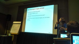
At LaGuardia about to fly home from a day-long session on university websites from the Neilsen Norman Group in NYC. I have to say, there is no happier line in any airport anywhere than the one of folks getting ready to head to Portland, Maine.
The conference was excellent. There is just no substitute for being in a room full of other people who are facing the same technical, political and design challenges you are. Great thoughts from people at Rutgers, Duke, Penn State, and as far afield as universities in Australia and Qatar.
I have pages of notes that I’m looking forward to processing next week, and a healthy list of next steps for our team at Bates. But here’s a quick summary of takeaways before they call our flight for boarding:
- Carousels/sliders on websites basically never add value to your users, who very rarely click on them.
- Site audits are terribly hard and terrifically important.
- Basically every higher ed site uses the word “alumni” to refer to fundraising — but most users (particularly prospective students and parents) look there for information on what alumni are up to, job prospects, etc.
-

Bates’ website got a shout out in the presentation. The hamburger menu icon that is so prevalent on mobile is not yet widely accepted on desktop. Solve this by adding the word “menu” beside it.
- Virtual campus tours are virtually useless.
- Higher Ed websites have an inexcusably low success rate among teenage users — 56%. This is below eCommerce (89%), news (80%), and even government (63%). Having worked so long on a government website, I have a personal appreciation for exactly how bad that is.
So, lots to do. And lots of opportunity to better serve our audiences! Onwards and upwards.