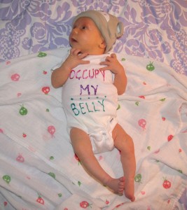
I have had a pretty amazing two weeks. On December 8th, my wife gave birth to our daughter, Rose, and ever since we have all been home together getting to know our new family. I’m lucky to have a job with a leave policy that has allowed me to take this time without too much trouble, and I wouldn’t trade these last two weeks for anything.
In terms of activity, our baby is like most of the others I’ve seen (except for the obvious fact that she is prettier, smarter, and clearly destined for greatness, at least in our eyes). She makes funny noises, hilarious faces, eats and subsequently runs through diapers like a champ, has skin softer than a pillowcase made of freshly laundered marshmallows, is continually surprised by her own hiccups, and sleeps like it’s going out of style. The closest thing I can compare to watching her in action is the experience of staring into a campfire — a miraculous, mesmerizing bundle of sudden responses to invisible stimuli that boggles the mind.
While spending two weeks with one baby by no means makes me an expert, I am now officially a user of the baby-caring experience. I have to say, I’ve been very impressed with the UI. Continue reading
 It’s not just websites, either. Now that I have usability on the brain, I notice it everywhere. In a public bathroom recently, I realized that the automatic paper towel dispenser — which was programmed to dispense a reasonable amount of paper towel as soon as the last one is ripped away — was positioned in such a way that the hanging paper blocked the hand soap dispenser. So after you wet your hands, you had to reach under the paper to get the soap (assuming you knew it was hiding there), inevitably getting the towel wet and soapy in the process. Usability police!
 Last week, Google unveiled its much-anticipated social networking platform